Content
back to Product Families
THE SOUND OF LIGHT
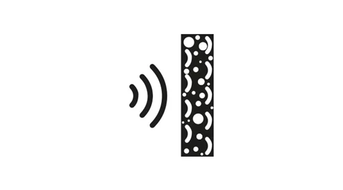
ACOUSTIC
Outstanding room acoustics and lighting tailored to individual needs are the foundation for an atmosphere of true harmony. ACOUSTIC brings these qualities together in a product family that allows spaces to be experienced in perfect balance.


SYMPHONY OF LIGHT AND ACOUSTICS
__
Well-being in a space depends largely on light and acoustics. ACOUSTIC unites these dimensions, opening new possibilities to design and illuminate environments holistically.
Through the targeted use of acoustically effective materials, ACOUSTIC reduces disruptive reverberation and creates a calm atmosphere that fosters focus, clarity, and communication. At the same time, advanced lighting technology delivers precise, efficient, glare-free illumination – adaptable to the requirements of diverse projects. The result is an inspiring, calming, and impressive environment.
DIVERSITY THAT SHAPES SPACES
__
The ACOUSTIC family offers solutions that illuminate spaces while enhancing their acoustic quality. A wide variety of shapes, sizes, and designs provide maximum freedom – from classic luminaires to iconic design statements and architectural panels. Divided into two categories – acoustic luminaires and acoustic panels – you’ll find the right solution to give every space its own character.
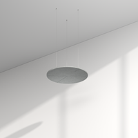
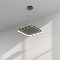
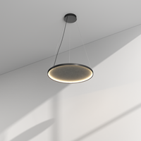
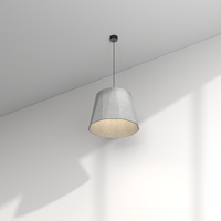
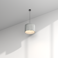
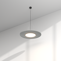
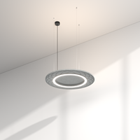
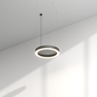
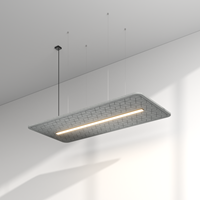
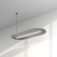
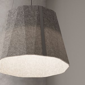
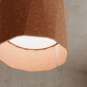
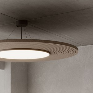
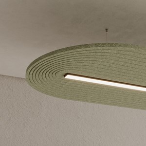
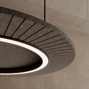
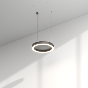
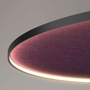
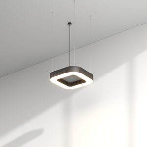
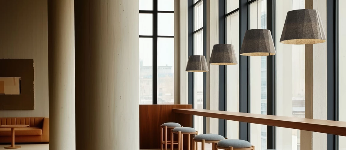
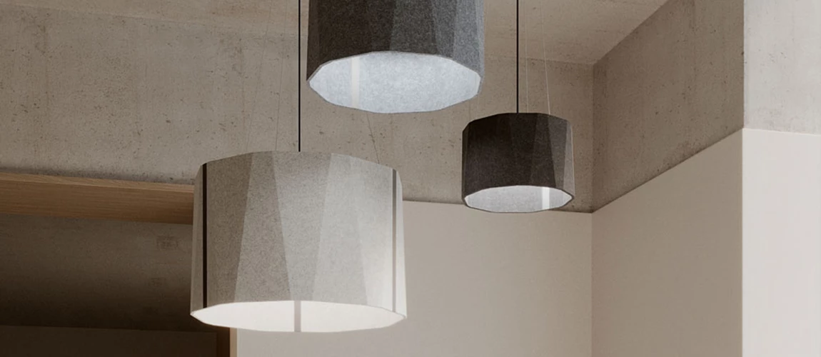
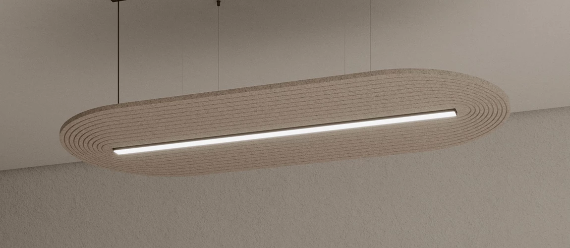
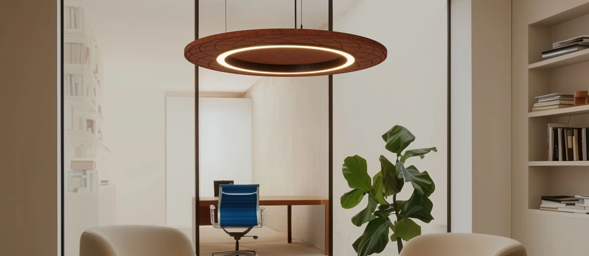
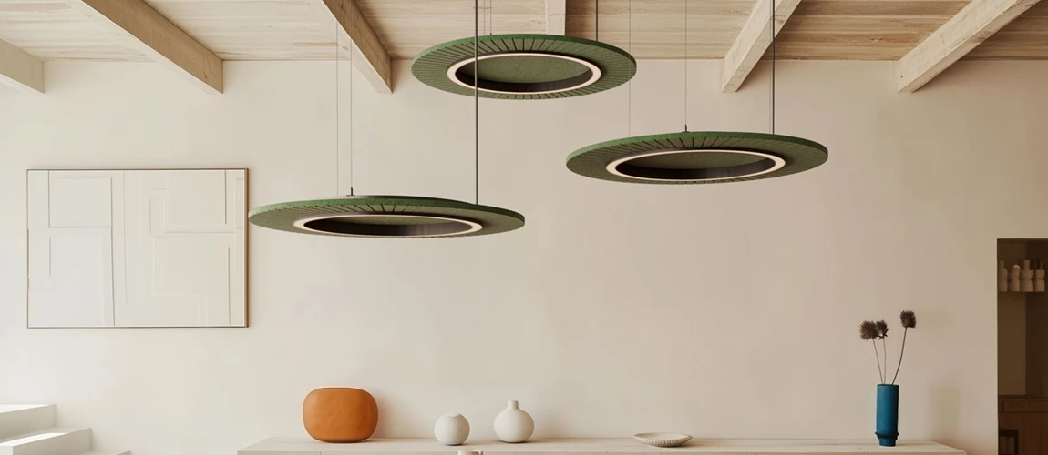
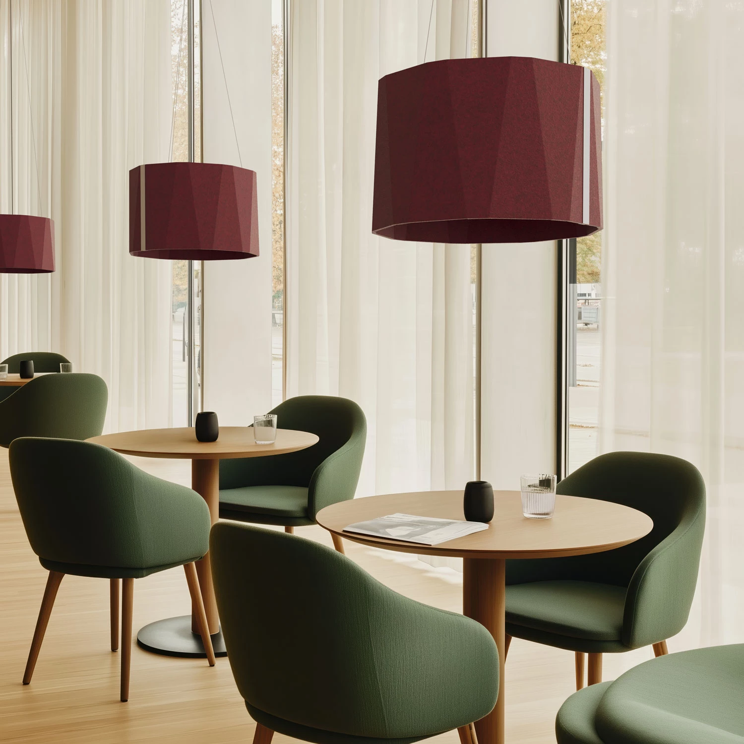
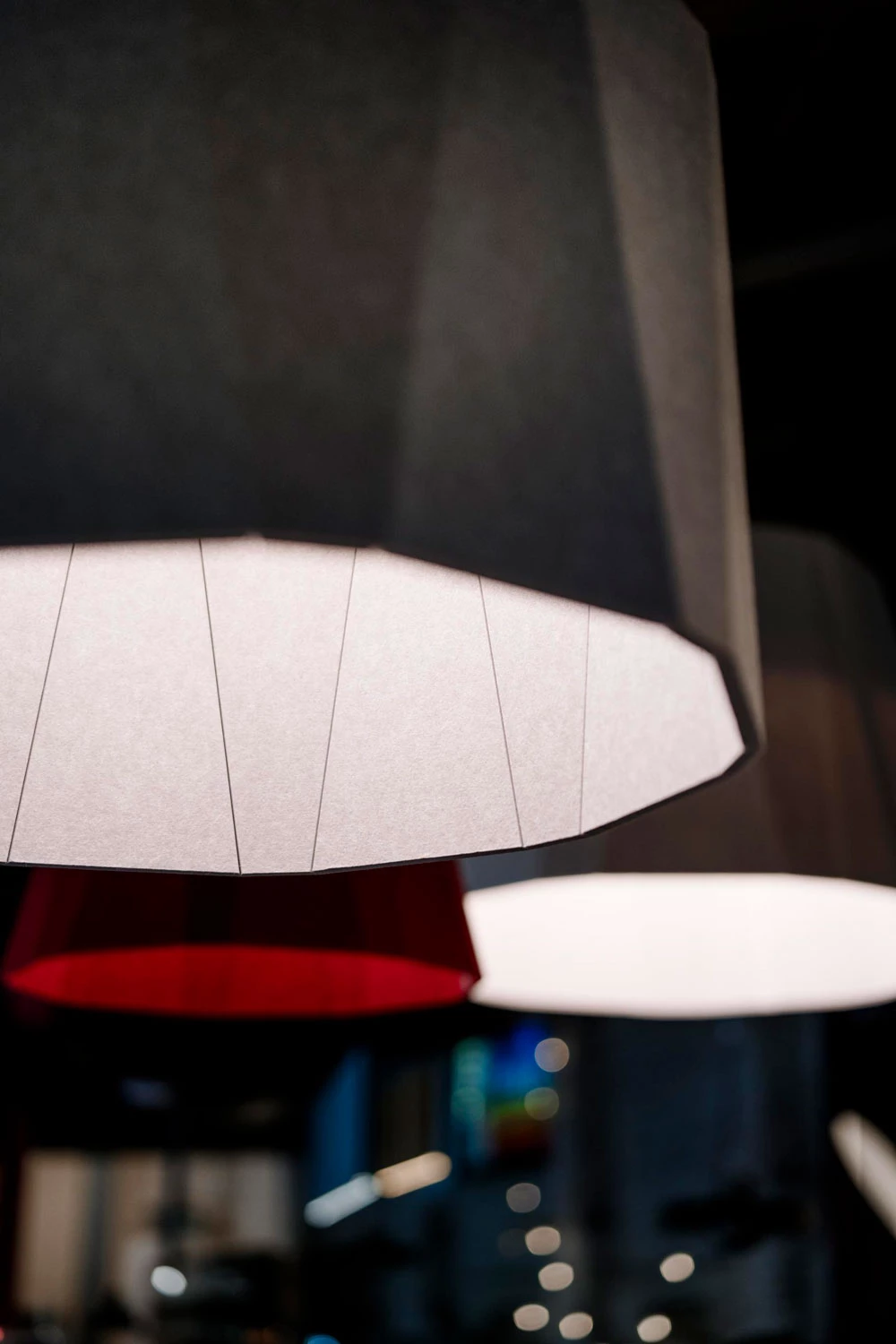
1. ACOUSTIC LUMINAIRES
The acoustic luminaires of the ACOUSTIC family combine functional lighting with acoustic performance in architectural forms. Each design balances atmosphere with function. Different sizes, designs, and options provide maximum flexibility for spaces that are both vibrant and calming.
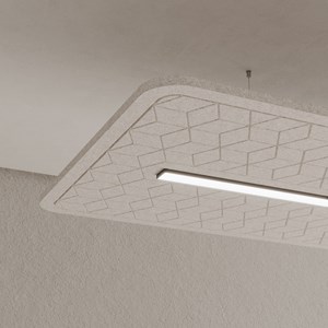

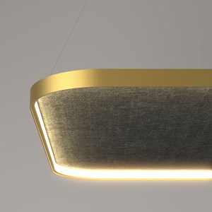
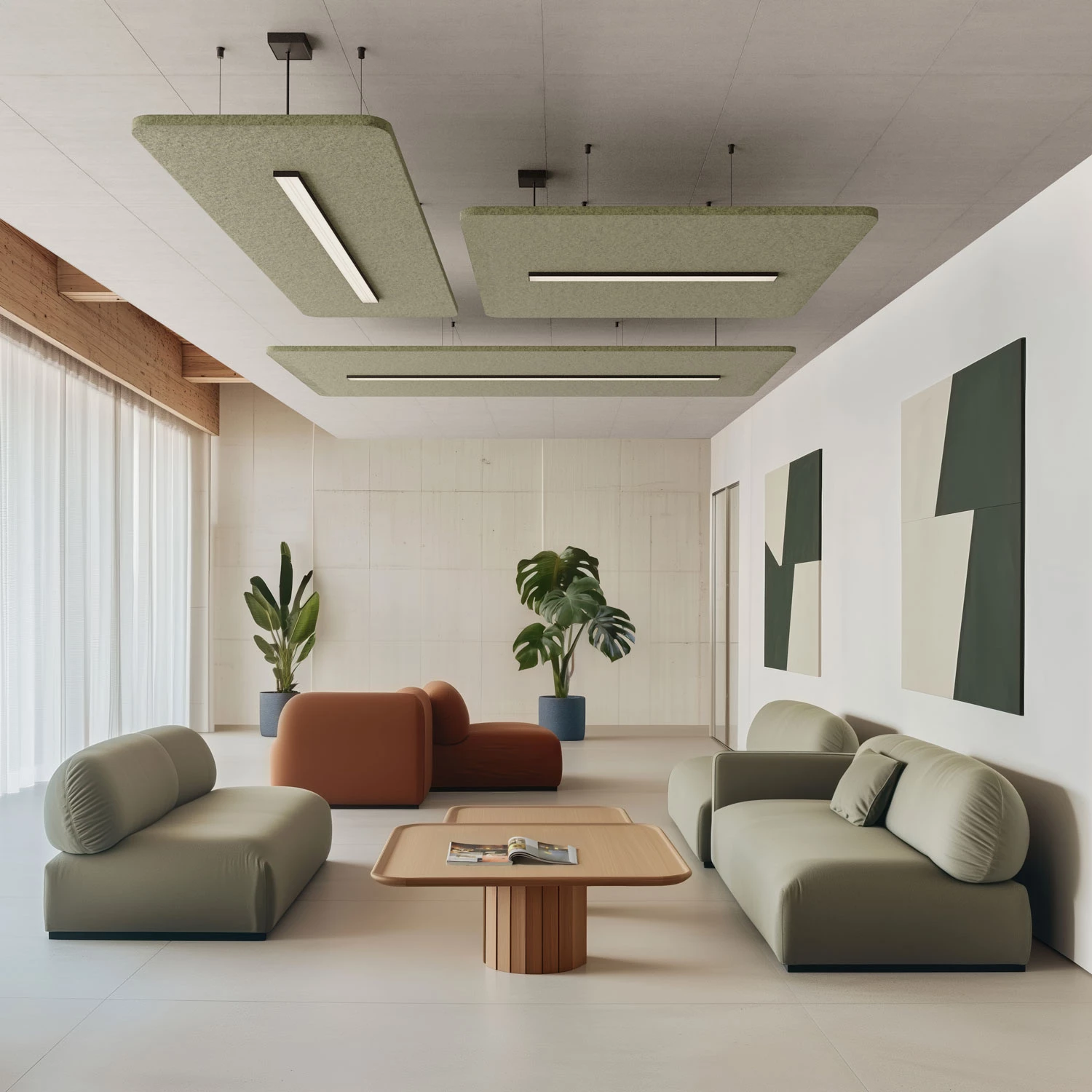
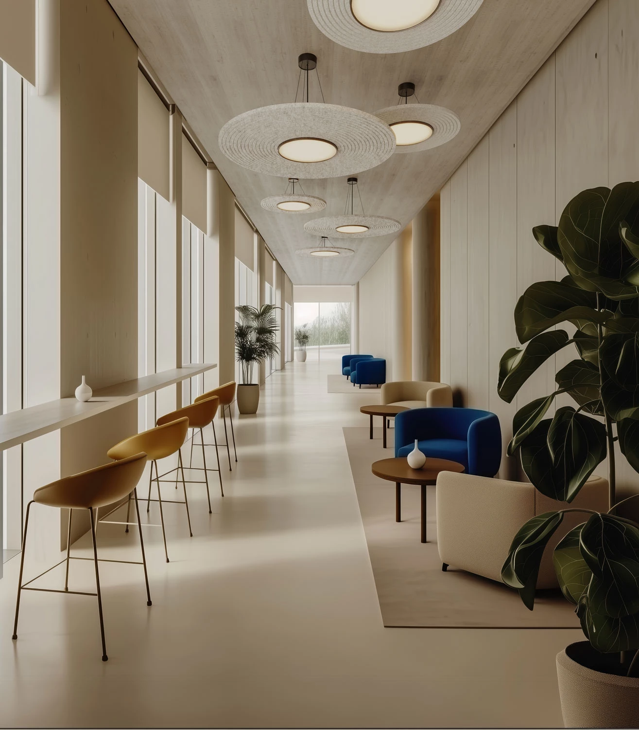
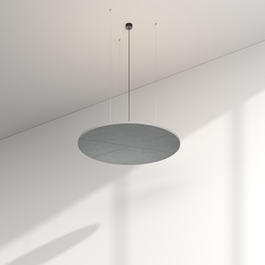
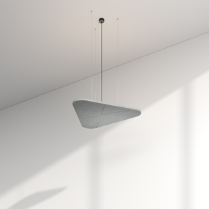
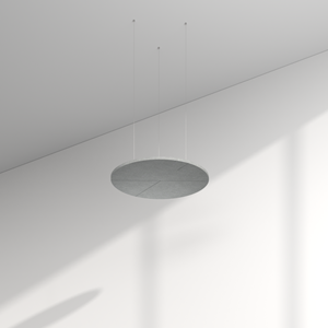
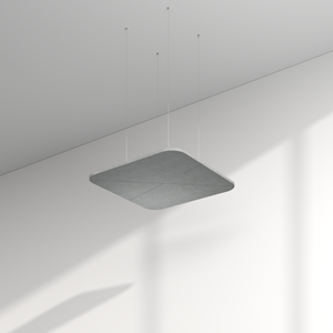
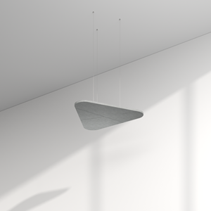
2. ACOUSTIC PANELS
The acoustic panels complement the luminaires with modular surfaces that structure spaces and elevate acoustic quality. Available in round, rectangular, and triangular forms – with or without integrated indirect lighting – they offer countless possibilities for clear, calm architecture.


Up to 160 lm/W efficiency
Maximum energy efficiency for sustainable projects and long-term low operating costs.

Glare-free light with various diffusers
Opal, clear, or microprismatic – for ideal atmospheres and enhanced visual comfort.

CRI > 90 for maximum colour fidelity
True-to-life reproduction – materials and surfaces appear authentic.

Indirect lighting
Soft ceiling illumination and visual lightness. Reduces glare in work zones, elevates interiors, and creates calm islands of light.

Flexible control: On/Off, DALI, Casambi, Matter
From simple switching to smart building systems – ACOUSTIC integrates seamlessly into existing infrastructures.

Colour variety
A broad palette of surfaces and colours – integrate acoustic elements harmoniously or use them as striking contrasts.
ACOUSTIC combines luminaires, panels and design classics to create a product range that perfectly combines light and acoustics.
SILENCE YOU CAN FEEL
__
The ACOUSTIC family is designed not only to shape the visual identity of a space, but also to create a calming acoustic environment. Sustainable materials and precise manufacturing deliver measurable improvements in spatial quality – proven in technical data, tangible in everyday life.
MORE ABOUT ACOUSTIC AT PROLICHT MORE ABOUT SUSTAINABILITY AT PROLICHT

Absorption
Reduces reverberation and creates noticeable calm – ideal for focus and clear communication.
Diffusion
Distributes sound waves evenly and prevents peaks – for balanced room acoustics.
Production in Götzens
Manufactured with state-of-the-art acoustic machinery at the PROLICHT site – precision made in Austria.
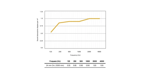
Transparent values
All acoustic performance data is documented in the datasheet – clear, reliable values for planning and comparison.
FOR ROOMS THAT CAN DO MORE
__
ACOUSTIC performs across a wide range of environments and adapts seamlessly to modern architectural concepts.
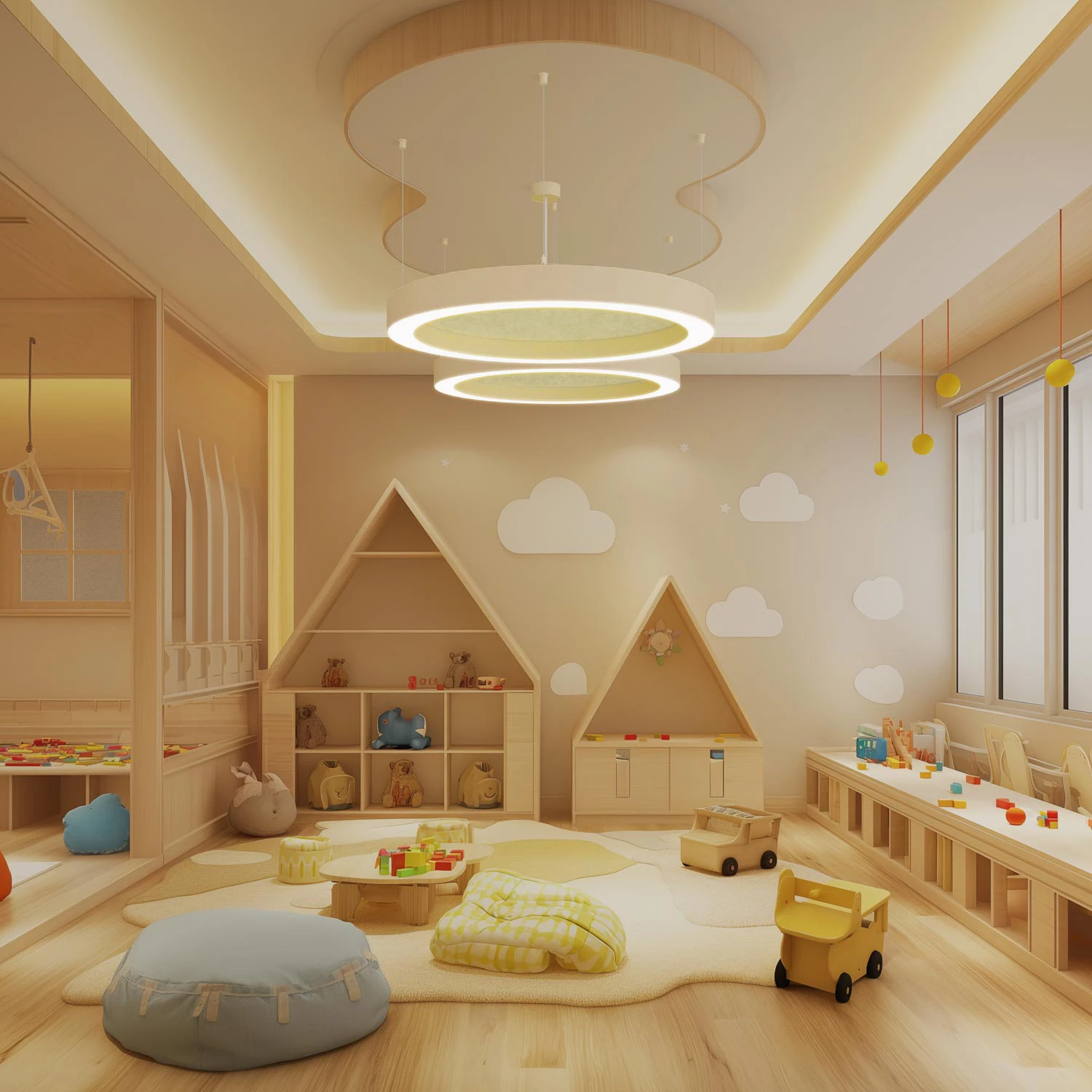
Education
Clear speech intelligibility and glare-free light create an ideal learning environment.
Retail & Open Space
Large areas gain structure, comfort, and architectural presence.
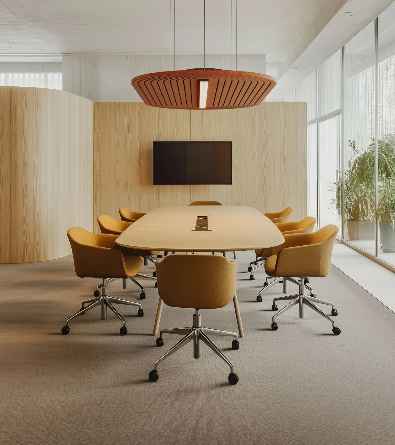
Office & Conference
Quiet atmospheres support focus, communication, and productivity.
Hospitality
Light and acoustics shape inviting atmospheres that inspire guests to stay.

ACOUSTIC combines design, technology and sustainability to create a product family that not only designs rooms, but also brings them to life.
THE STRENGTHS OF ACOUSTIC
__
Performance & comfort
Efficient lighting technology, high visual comfort, and improved room acoustics create spaces that are both inspiring and comfortable.
Sustainability
Material from recycled PET bottles and local manufacturing in Götzens ensure conscious material use and regional precision.
Individual configurability
From light colours and controls to surfaces and designs – ACOUSTIC can be configured precisely for any project.
Planning reliability
Documented acoustic and light values, straightforward installation, and smart controls ensure seamless implementation.
DESIGN SPACES IN PERFECT HARMONY
__
Discover the possibilities of ACOUSTIC and bring light and acoustics into balance. Whether through direct configuration or personal consultation, the path to your project begins here.